
Times New Roman. Georgia. Arial. Verdana. Futura. Baskerville. Comic Sans MS.
I think you get the picture.
Be Bold! But Not Too Bold
When selecting a font, it is of utmost importance that you first decide whether you will consort with the serifs or the sans-serifs. The former illustrates formality, power, gusto; the latter illustrates contemporary modern, the avante-garde of society. Take a peek at the major difference noted below, particularly paying close attention to the drastic change Google implemented earlier this month:

![]()
Side note: this font will only serve as your primary typeface, which actually means that the other one will be your secondary. More successful websites utilize a delicate balance of both serif and sans-serif fonts in order to fully convey their purpose.
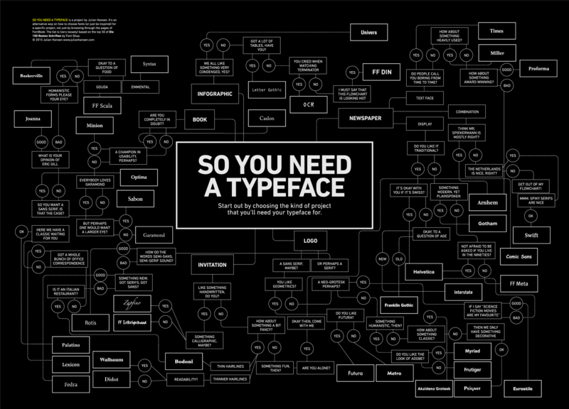
I Ain’t Got No Type (Yet)
Once we have selected the main font for the webpage, it is of secondary importance that you now decide the specific font typography—that is, which font will you use that follows either the serifs or the sans-serifs format?
Follow the diagram’s path that is displayed:
“I never forget a (type)face,” said the prosecutor.
Do you want YOUR typeface to be forgettable? Or memorable?
Any Free Time?
If you can spare 80 minutes, I highly recommend you view the documentary as it provides an extraordinarily in-depth look at the development and design of Helvetica.
Sources
Go ahead and explore these useful links that were referenced throughout the post:
http://www.huffingtonpost.com/2014/07/28/font-ranking_n_5625650.html

Leave a comment